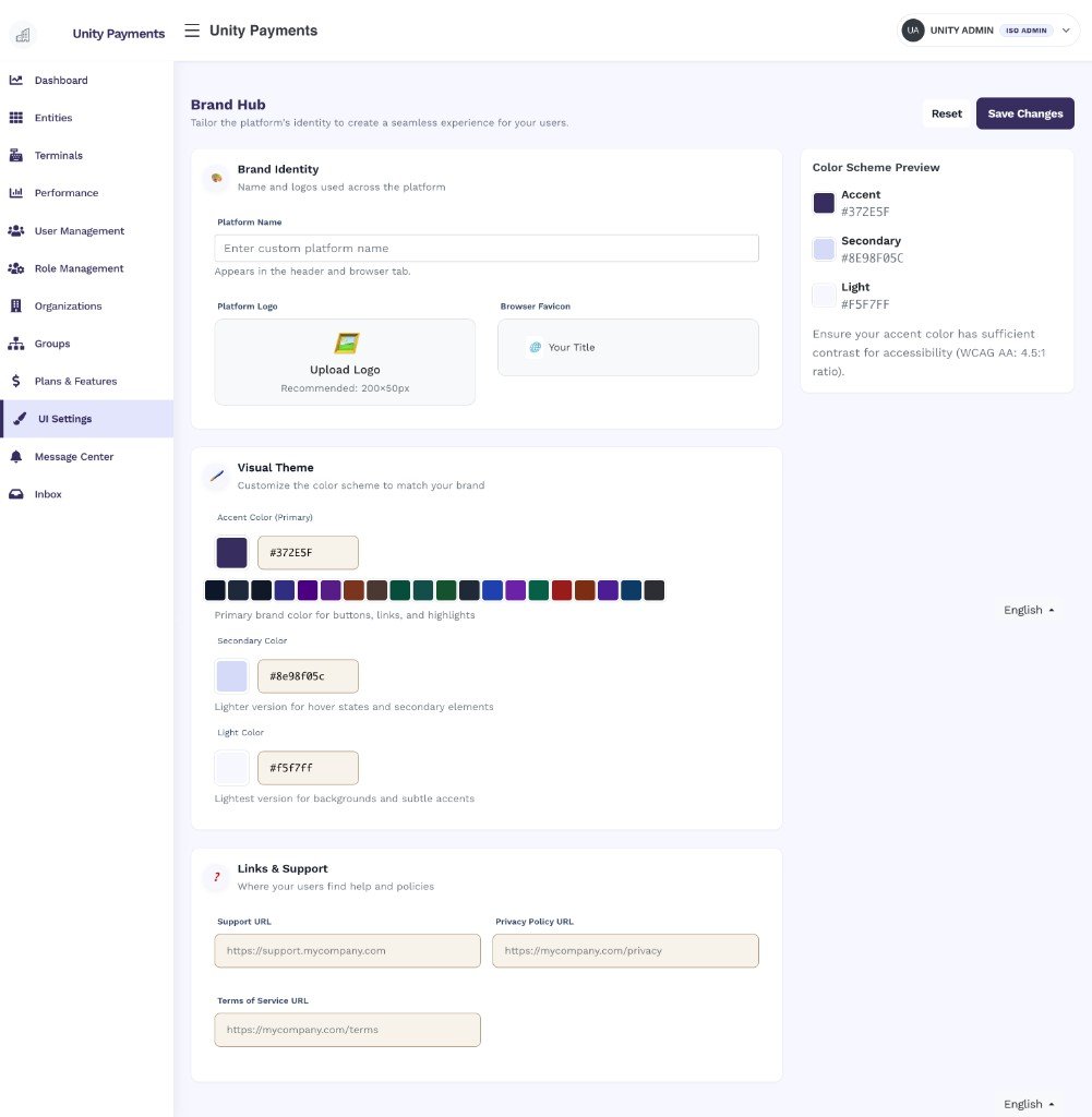
The Brand Hub page showing the Brand Identity, Visual Theme, and Links & Support sections alongside the Color Scheme Preview sidebar.
Brand Identity
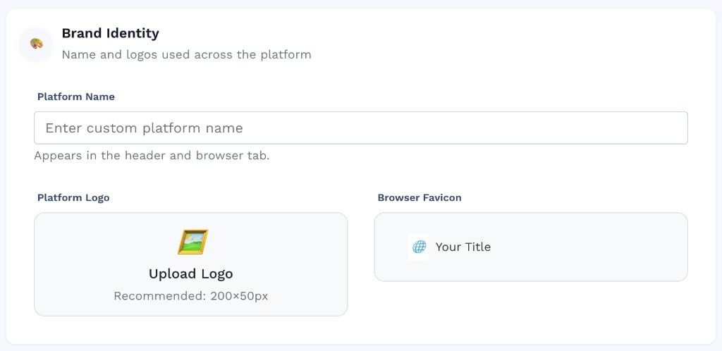
The Brand Identity section showing the Platform Name field and upload areas for the Platform Logo and Browser Favicon.
Uploading a file — click the upload area to open the file picker. A preview appears immediately after selection.
Removing a file — hover over the uploaded image and click the red trash icon that slides in from the top-right corner. If the file has already been saved, it is deleted from the server immediately. If the file was just selected but not yet saved, it is cleared from the form without a server request.
Visual Theme
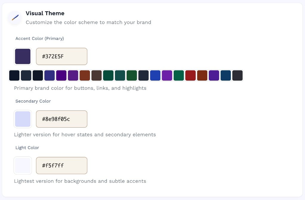
The Visual Theme section with color pickers for Accent, Secondary, and Light, and a row of 20 suggested color swatches.
Setting a color — click the color swatch to open the native color picker, or type a hex value directly into the text input. Use the row of 20 preset swatches to quickly apply a curated dark or brand-safe color.
Auto-derived colors — when you change the Accent color, the Secondary and Light values are automatically recalculated as lighter tints of the accent (75% and 95% lightened, respectively). You can override them manually at any time.
The Color Scheme Preview sidebar on the right updates in real time as you change colors, so you can verify the combination before saving.
Links & Support
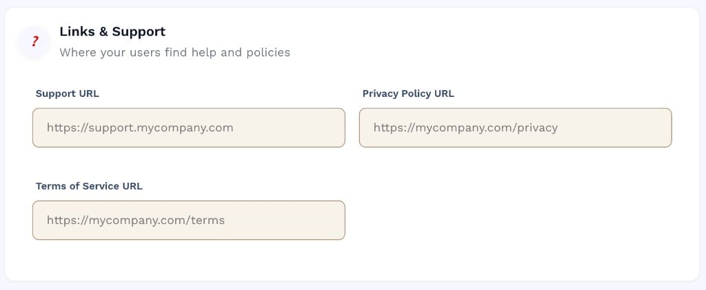
The Links & Support section showing Support URL, Privacy Policy URL, and Terms of Service URL fields.
Color Scheme Preview
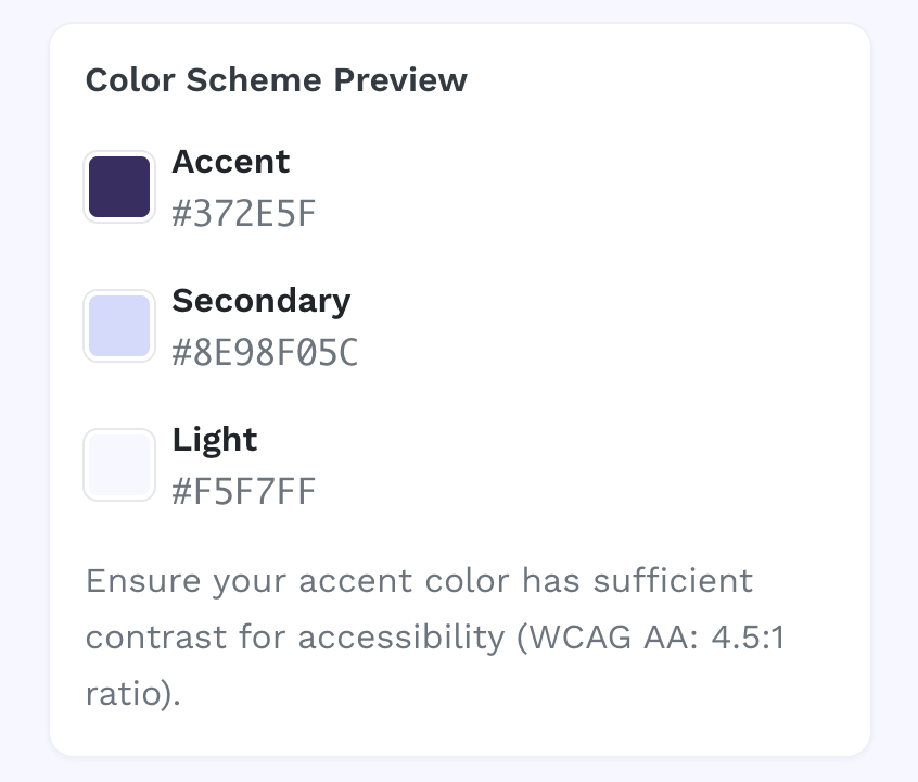
The Color Scheme Preview sidebar showing live swatches for Accent, Secondary, and Light with hex values and an accessibility note.
Ensure your Accent color provides sufficient contrast against white text to meet the WCAG AA accessibility standard (minimum 4.5:1 contrast ratio). Low-contrast accent colors can make buttons and links difficult to read for users with visual impairments.